
10 Powerful Responsive Design Tips for Modern Websites
In today’s digital world, people browse websites on smartphones, tablets, laptops, and large desktop screens. If your website fails to adapt to different screen sizes, visitors may leave within seconds. That is why responsive design has become one of the most important parts of modern web development.
A responsive website automatically adjusts its layout, images, and content according to the user’s device. Whether someone visits your site from a mobile phone or a widescreen monitor, the experience remains smooth and user-friendly. This not only improves usability but also supports better search engine rankings and higher conversion rates.
This comprehensive guide explains everything you need to know about responsive website design, including its benefits, key principles, best practices, and common mistakes to avoid.

What Is Responsive Design?
Responsive design is a web development approach that allows a website to adapt to different screen sizes and resolutions automatically. Instead of creating separate versions of a site for desktop and mobile users, a responsive website uses flexible layouts and CSS techniques to provide a consistent experience across all devices.
The main goal is simple: make websites easy to read, navigate, and interact with regardless of screen size.
Responsive websites typically use:
- Flexible grids
- Fluid images
- CSS media queries
- Adaptive typography
- Mobile-friendly navigation
This approach ensures that users enjoy a seamless browsing experience without excessive zooming or horizontal scrolling.
Read More: Best Email Marketing Tips
Why Responsive Design Matters
Better User Experience
A responsive website improves readability and navigation. Visitors can easily browse your content without struggling with broken layouts or tiny text.
Improved SEO Performance
Search engines prioritize mobile-friendly websites. Google uses mobile-first indexing, meaning it primarily evaluates the mobile version of your website for ranking purposes. A strong responsive design strategy can positively impact your SEO efforts.
Faster Website Management
Managing one responsive website is easier and more cost-effective than maintaining separate desktop and mobile versions.
Higher Conversion Rates
When users can browse comfortably on any device, they are more likely to stay longer, engage with your content, and complete actions such as purchases or form submissions.
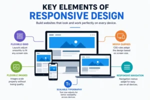
Key Elements of Responsive Website Design
Fluid Grid Layouts
Traditional websites used fixed-width layouts. Responsive websites use flexible grids based on percentages instead of pixels. This allows page elements to resize naturally according to screen dimensions.
Flexible Images
Images should scale properly without losing quality or breaking layouts. Developers often use CSS properties like:
max-width: 100%;
height: auto;
This ensures images fit inside their containers on all devices.
Media Queries
Media queries are one of the most important tools in responsive design. They allow developers to apply different styles based on screen size, resolution, or device orientation.
For example:
@media (max-width: 768px) {
  body {
    font-size: 16px;
  }
}
This changes styling for smaller screens such as tablets and smartphones.
Mobile-Friendly Navigation
Navigation menus must work smoothly on smaller screens. Hamburger menus, collapsible navigation bars, and sticky menus are commonly used in responsive websites.
Responsive Design vs Adaptive Design
Many people confuse responsive design with adaptive design. While both aim to improve usability across devices, they work differently.
| Feature | Responsive Design | Adaptive Design |
|---|---|---|
| Layout Style | Flexible and fluid | Fixed layouts |
| Screen Adjustment | Automatically adapts | Uses predefined layouts |
| Maintenance | Easier | More complex |
| Development Cost | Usually lower | Often higher |
| SEO Benefits | Strong mobile SEO support | Can vary |
Responsive design is generally the preferred choice because it offers greater flexibility and easier long-term maintenance.
Best Practices for Responsive Website Design
Use a Mobile-First Approach
A mobile-first strategy means designing for smaller screens before expanding to larger devices. This encourages cleaner layouts and better performance.
Optimize Website Speed
Mobile users expect fast-loading pages. Compress images, reduce unnecessary scripts, and use browser caching to improve performance.
Fast websites improve both user experience and SEO rankings.
Prioritize Readability
Readable text is essential for a successful responsive website. Use:
- Clear font sizes
- Proper spacing
- Short paragraphs
- High contrast colors
Avoid cluttered layouts that overwhelm users.
Test on Multiple Devices
Always test your website on different screen sizes and browsers. A design that looks perfect on one device may break on another.
Useful testing tools include:
- Browser developer tools
- Responsive testing platforms
- Real mobile devices
Use Scalable Typography
Text should adjust naturally across devices. CSS units like em, rem, and viewport-based units help maintain readability.
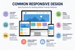
Common Responsive Design Mistakes to Avoid
Ignoring Mobile Users
Some websites still prioritize desktop layouts while treating mobile users as secondary. Since a large percentage of web traffic now comes from smartphones, this approach can hurt engagement and SEO.
Overloading the Page
Too many animations, large images, or unnecessary popups can slow down mobile performance.
Poor Touchscreen Optimization
Buttons and links should be easy to tap. Small clickable elements frustrate users on mobile devices.
Using Fixed Width Elements
Fixed-width containers can break layouts on smaller screens. Always use flexible sizing whenever possible.
Not Testing Regularly
Technology changes constantly. Regular testing ensures your responsive website continues to perform well on new devices and browsers.
SEO Benefits of Responsive Design
Search engines favor websites that provide a smooth mobile experience. A properly implemented responsive design strategy offers several SEO advantages:
Lower Bounce Rate
Users are more likely to stay on a site that works well on their device.
Faster Loading Speed
Page speed is a ranking factor. Responsive websites often perform better when optimized correctly.
Better User Engagement
Improved usability encourages visitors to browse more pages and spend more time on your website.
Easier Indexing
Maintaining one responsive website simplifies crawling and indexing for search engines.
Increased Mobile Traffic
A mobile-friendly site attracts and retains more smartphone users.
Tools That Help with Responsive Website Design
Several tools can simplify responsive development and testing:
Bootstrap
Bootstrap is one of the most popular responsive frameworks. It provides ready-made grid systems and components.
CSS Grid and Flexbox
Modern CSS technologies like Grid and Flexbox make responsive layouts easier to create and maintain.
Google Mobile-Friendly Test
This tool helps identify mobile usability issues that may affect SEO performance.
Chrome DevTools
Chrome DevTools allows developers to preview websites on multiple screen sizes directly in the browser.
Future Trends in Responsive Design
Responsive web design continues to evolve as new devices and technologies emerge.
AI-Driven Personalization
Websites are increasingly adapting layouts and content based on user behavior and preferences.
Voice Search Optimization
As voice search grows, responsive websites must support conversational search experiences.
Foldable Device Support
Designers are now preparing websites for foldable smartphones and dual-screen devices.
Dark Mode Compatibility
Modern responsive websites often include automatic dark mode support for better user comfort.
Conclusion
Responsive website design is no longer optional. It is an essential part of building modern, user-friendly, and SEO-optimized websites. A strong responsive design strategy ensures your website looks professional, loads efficiently, and functions smoothly across all devices.
By focusing on flexible layouts, mobile usability, fast performance, and proper testing, businesses can improve user engagement and search engine visibility at the same time.
Whether you are building a personal blog, an eCommerce store, or a corporate website, responsive design helps create a better experience for every visitor.
FAQs
1. What is responsive design in web development?
Responsive design is a web design approach that allows websites to adapt automatically to different screen sizes and devices.
2. Why is responsive design important for SEO?
Responsive websites improve mobile usability, loading speed, and user experience, which are all important SEO ranking factors.
3. What is the difference between responsive and adaptive design?
Responsive design uses flexible layouts that adjust automatically, while adaptive design uses fixed layouts designed for specific screen sizes.
4. Which framework is best for responsive website design?
Bootstrap is one of the most widely used frameworks because it provides responsive grids, components, and mobile-friendly features
